This is an introduction to Our World in Data – the web publication that shows how global living conditions are changing.
A recent
survey asked “All things considered, do you think the world is getting better or worse, or neither getting better nor worse?”. In Sweden 10% thought things are getting better, in the US they were only 6%, and in Germany only 4%. Very few people think that the world is getting better.
What is the evidence that we need to consider when answering this question? The question is about how the world has changed and so we must take a historical perspective. And the question is about the world as a whole and the answer must therefore consider everybody. The answer must consider the history of global living conditions – a history of everyone.
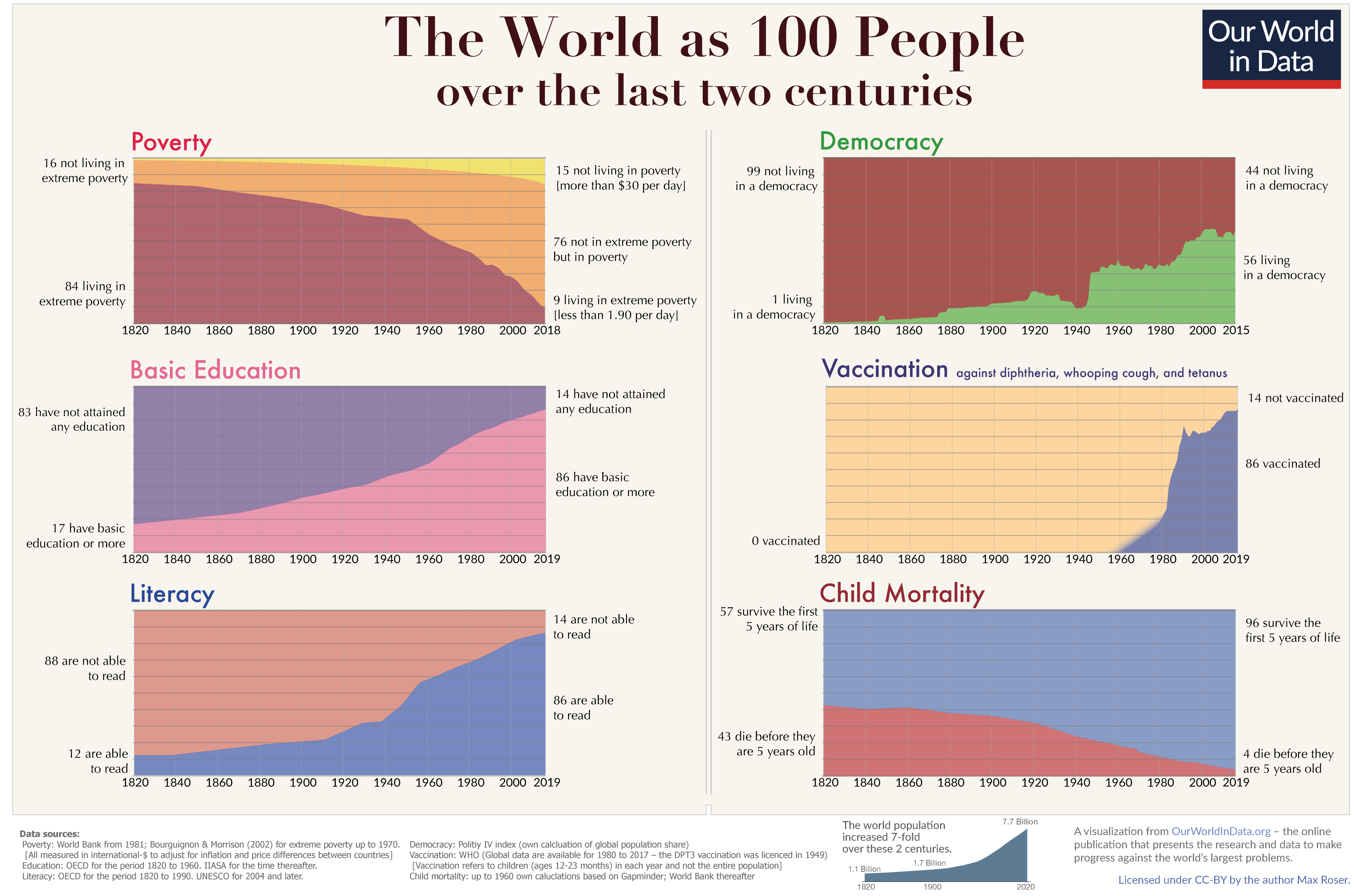
I. Poverty
To see where we are coming from we must go far back in time. 30 or even 50 years are not enough. When you only consider what the world looked during our life time it is easy to make the mistake of thinking of the world as relatively static – the rich, healthy and educated parts of the world here and the poor, uneducated, sick regions there – and to falsely conclude that it always was like that and that it will always will be like that.
Take a longer perspective and it becomes very clear that the world is not static at all. The countries that are rich today were very poor just very recently and were in fact worse off than the poor countries today.
To avoid portraying the world in a static way – the North always much richer than the South – we have to start 200 years ago before the time when living conditions really changed dramatically.
Researchers measure extreme poverty as living with less than 1.90$ per day. These poverty figures take into account non-monetary forms of income – for poor families today and in the past this is very important, particularly because of subsistence farming. The poverty measure is also corrected for different price levels in different countries and adjusted for price changes over time (inflation) – poverty is measured in so-called international dollars that accounts for these adjustments.
The first chart shows the estimates for the share of the world population living in extreme poverty.
In 1820 only a tiny elite enjoyed higher standards of living, while the vast majority of people lived in conditions that we would call extreme poverty today. Since then the share of extremely poor people fell continuously. More and more world regions industrialised and thereby increased productivity which made it possible to lift more people out of poverty: In 1950 three-quarters of the world were living in extreme poverty; in 1981 it was still 44%. For last year the research suggests that the share in extreme poverty has fallen below 10%.
That is a huge achievement, for me as a researcher who focusses on growth and inequality maybe the biggest achievement of all in the last two centuries. It is particularly remarkable if we consider that the world population has increased 7-fold over the last two centuries – switch to the ‘Absolute’ view in the visualisation below to see the number of people in and out of poverty. In a world without
economic growth, such an increase in the population would have resulted in less and less income for everyone; A 7-fold increase in the world population would have been enough to drive everyone into extreme poverty. Yet, the exact opposite happened. In a time of unprecedented population growth our world managed to give more prosperity to more people and to continuously lift more people out of poverty.
Increasing productivity was important because it made vital goods and services less scarce: more food, better clothing, and less cramped housing. Productivity is the ratio between the output of our work and the input that we put in our work; as productivity increased we benefitted from more output, but also from less input – weekly working hours
fell very substantially.
Economic growth was also so very important because it changed the relationship between people. In the long time in which the world lived in a non-growth world the only way to become better off is if someone else got worse off. Your own good luck is your neighbours bad luck. Economic growth changed that, growth made it possible that you are better off when others become better off. The ingenuity of those that built the technology that increased productivity – the car, the machinery, and communication technology – made some of them very rich and at the same time it increased the productivity and the incomes of others. It is hard to overstate how different life in zero-sum and a positive-sum economy are.
Unfortunately the media is overly obsessed with reporting single events and with things that go wrong and does not nearly pay enough attention to the slow developments that reshape our world. With this empirical data on the reduction of poverty we can make it more concrete what a media that would report global development would look like. The headline could be “The number of people in extreme poverty fell by 130,000 since yesterday” and they wouldn’t have this headline once, but since – on average – there were 130,000 people fewer in extreme poverty every single day they should have had this headline every single day since 1990.
II. Literacy
How did the education of the world population’s change over this period? The chart below shows the share of the world population that is
literate over the last 2 centuries. In the past only a tiny elite was able to read and write. Today’s education – including in today’s richest countries – is again a very recent achievement. It was in the last two centuries that literacy became the norm for the entire population.
In 1820 only every 10th person was literate; in 1930 it was every third and now we are at 85% globally. Put differently, if you were alive in 1800 there was a chance of 9 in 10 that you weren’t able to read – today more than 8 out of 10 people are able to read. And if you are young chances are much higher since many of today’s illiterate population are
old.
If you think science, technology, political freedom are important to solve the world’s problems and you think that it helps to read and write to do this then look at the figures in absolute numbers. In 1800 there were 120 million people in the world that could read and write; today there are 6.2 billion with the same skill.
III. Health
One reason why we do not see progress is that we are unaware of how bad the past was.
In 1800 the health conditions of our ancestors were such that around 43% of the world’s newborns died before their 5th birthday. The historical estimates suggest that the entire world lived in poor conditions; there was relatively little variation between different regions, in all countries of the world more than every third child died before it was 5 years old.
It would be wrong to believe that modern medicine was the only reason for improved health. Initially rising prosperity and the changing nature of social life mattered more than medicine. It were improvements in housing and sanitation that improved our chances in the age old war against infectious disease. Healthier diet – made possible through
higher productivity in the agricultural sector and
overseas trade – made us more resilient against disease. Surprisingly improving nutrition and health also made us
smarter and taller.
But surely science and medicine mattered as well. A more educated population achieved a series of scientific breakthroughs that made it possible to reduce mortality and disease further. Particularly important was the discovery of the germ theory of disease in the second half of the 19th theory. In retrospect it is hard to understand why a new theory can possibly be so important. But at a time when doctors did not wash their hands when switching from post-mortem to midwifery the theory finally convinced our ancestors that hygiene and public sanitation are crucial for health.
The germ theory of disease laid the foundation for the development of antibiotics and vaccines, and it helped the world to see why public health is so very important. Public health mattered hugely: Everybody benefits from everybody else being
vaccinated, and everybody benefits from everybody else obeying the rules of hygiene.
With these changes global health improved in a way that was unimaginable to our ancestors. In 2015
child mortality was down to 4.3% – 100-fold lower than 2 centuries ago. You have to take this long perspective to see the progress that we have achieved.
IV. Freedom
Political freedom and civil liberties are at the very heart of development – as they are both a means for development and an end of development. Journalism and public discourse are the pillars on which this freedom rests, but qualitative assessments of these aspects bears the risk that we are mistakingly perceiving a decline of liberties over time when in fact we are raising the bar by which we judge our liberty. Quantitative assessments can therefore be useful when they help us to measure freedom against the same yardstick across countries and over time.
There are various attempts to measure the types of political regimes that govern the world’s countries and to capture something as complex as a political system is necessarily controversial. There is just no way around that. In this analysis I will rely on the Polity IV index as it is the
least problematic of the measures that present a long term perspective. The index measures political regimes on a spectrum from +10 for full democracies to -10 for full autocracies; regimes that fall somewhere in the middle of this spectrum are called anocracies. To this I added information about the world’s countries that were ruled by other countries as part of a colonial empire.
Again I want to give a time perspective to get a perspective on how political freedom has changed over the last 200 years.
The chart shows the share of people living under different types of political regimes over the last 2 centuries. Throughout the 19th century more than a third of the population lived in colonial regimes and almost everyone else lived in autocratically ruled countries. The first expansion of political freedom from the late 19th century onward was crushed by the rise of authoritarian regimes that in many countries took their place in the time leading up to the Second World War.
In the second half of the 20th century the world has changed significantly: Colonial empires ended(link), and more and more countries turned democratic: The share of the world population living in democracies increased continuously – particularly important was the breakdown of the Soviet Union which allowed more countries to democratise. Now more than every second person in the world lives in a democracy.
The huge majority of those living in an autocracy – 4 out of 5 of those that live in an authoritarian regime – live in one country autocracy: China.
Human rights are similarly difficult to measure consistently over time and across time. The
best empirical data show that after a time of stagnation human right protection improved globally over the last 3 decades.
V. Fertility
If you click on ‘Absolute’ in any of the previous charts you see the increase of the world population over the last 2 centuries. The world population was around 1 billion in the year 1800 and increased 7-fold since then.
Population growth increased humanity’s demand for resources and amplified humanity’s impact on the environment. But this increase of the world population should evoke more than doom and gloom. First of all, this increase shows a tremendous achievement. It shows that humans stopped dying at the rate at which our ancestors died for the many millennia before.
In pre-modern times fertility was high – 5 or 6 children per woman were the norm. What kept the population growth low was the very high rate with which people died and that meant that many children were dead before they reached their reproductive age. The increase of the world population followed when humanity started to win the fight against death. Global life expectancy
doubled just over the last hundred years.
Population growth is a consequence of fertility and mortality not declining simultaneously. The fast population growth happened when fertility was still as high as it was in the unhealthy environment of the past, but mortality has already declined to the low levels of our time.
What we have
seen in country after country over the last 200 years is that once women realise that the chances of their children dying has declined substantially they adapt and chose to have fewer children. Population growth then comes to an end. This transition from high mortality and fertility to low mortality and fertility is called the
demographic transition. In those countries that industrialised first it lasted at least from the mid 19th century to the mid 20th century – it took 95 years for fertility to decline from above 6 children to less than 3 children per woman in the UK. Countries that followed later sometimes achieved this transition much
faster: South Korea went from more than 6 children per woman to less than 3 in just 18 years, Iran even achieved it in just 10 years.
Just as countries went through this transition so is the world going through this transition. Global fertility has more than halved in the last 50 years, from more than 5 children per woman in the early 1960s to below 2.5 today. This means that the world is well into the demographic transition and global population growth has in fact
peaked half a century ago.
Now that we
see fertility declining everywhere we come to an end of population growth: The global population has quadrupled over the course of the 20th century, it will not double anymore over the course of this century. And at the end of the century
the UN expects a slow annual population growth of 0.1% whereas the demographers from
IIASA expect an end of population growth around the year 2075.
VI. Education
None of the achievements over the last 2 centuries could have been achieved without the expansion of knowledge and education. The revolution in how we live was not only driven by education it also made education more important than ever.
And we know that education is on track to improve globally. Contrary to many other social aspects where forecasts are of limited use, I think education is an aspect where we can make some useful projections into the future. The simple reason is that the educational composition today tells us something about the education of tomorrow – a literate young woman today will be a literate old woman in 2070 and a student with secondary education now will be a graduate with secondary education in the future.
The younger cohort today is
much better educated than the older cohorts. And as the cohort size is decreasing schools that are already in place can provide better for the next generation.
The visualisation below shows the projection of the IIASA institute for the size and the educational composition of the world population until 2100.
It is an interesting look into the future: With today’s lower global fertility the researchers expect that the number of children will decline from now – there will never be more children on the planet than today. And as mentioned before the IIASA researchers expect the world population to peak in 2070 and to decline thereafter.
Focussing on the educational breakdown the projection suggests that by 2100, there will be almost no one without formal education and and there will be more than 7 billion minds who will have received at least secondary education.
With the great importance of education for improving health, increasing political freedom, and ending poverty this projection is very encouraging.
VII. Why do we not know this?
The motivation for this history of global living conditions was the survey result that documented the very negative perspective of global development that most of us have. How does that fit with the empirical evidence?
I do not think they are the only ones to blame, but I do think that the media is to blame for some part of this. This is because the media does not tell us how the world is changing, it tells us what in the world goes wrong.
One reason why the media focusses on things that go wrong is that the media focusses on single events and single events are often bad – look at the news: plane crashes, terrorism attacks, natural disasters, election outcomes that we are not happy with.
Positive developments on the other hand often happen very slowly and never make the headlines in the event-obsessed media.
The result of a media – and education system – that fails to present quantitative information on long-run developments is that the huge majority of people is completely ignorant about global development. Even the decline of global extreme poverty – by any standard one of the most important developments in our lifetime – is only known by a small fraction of the population of the UK (10%) or the US (5%). In both country’s the majority of people think that the share living in extreme poverty has increased. Two thirds in the US even think the share in extreme poverty has ‘almost doubled’. When we are ignorant about global development it is not surprising that few think that the world is getting better.
The only way to tell a history of everyone is to use statistics, only then can we hope to get an overview over the lives of the 22 billion people that lived in the last 200 years. The developments that these statistics reveal transform our global living conditions – slowly but steadily. They are reported in this online publication –
Our World in Data – that my team and I have been building over the last years. We see it as a resource to show these long-term developments and thereby complement the information in the news that focus on events.
The difficulty for telling the history of how everyone’s lives changed over the last 200 years is that you cannot pick single stories. Stories about individual people are much more engaging – our minds like these stories – but they cannot be representative for how the world has changed. To achieve a representation of how the world has changed at large you have to tell many, many stories all at once; and that is statistics.
To make it easier for myself and for you to understand the transformation in living conditions that we have achieved I made a summarizing visualisation in which I imagine this 200 year history as the history of a group of 100 people to see how the lives of them would have changed if they lived through this transformative period of the modern world
here you can download the 200 year chart in high resolution.
VIII. Why it matters that we do not know this
The successful transformation of our living conditions was possible only because of collaboration. Such a transformation would be impossible for a single person to accomplish.
It is our collective brains and our collaborative effort that are needed for such an improvement.
There are big problems that remain. None of the above should give us reason to become complacent. On the contrary, it shows us that a lot of work still needs to be done – accomplishing the fastest reduction of poverty is a tremendous achievement, but the fact that 1 out of 10 lives in extreme poverty today is unacceptable. We also must not accept the restrictions of our liberty that remain and that are put in place. And it is also clear that humanity’s impact on the environment is at a level that is not sustainable and is endangering the biosphere and climate on which we depend. We urgently need to reduce our impact.
It is far from certain that we will make progress against these problems – there is no iron law that would ensure that the world continues this trend of improving living conditions. But what is clear from the long-term perspective is that the last 200 years brought us to a better position than ever before to solve these problems. Solving problems – big problems – is always a collaborative undertaking. And the group of people that is able to work together today is a much, much stronger group than there ever was on this planet. We have just seen the change over time; the world today is healthier, richer, and better educated.
For our history to be a source of encouragement we have to know our history. The story that we tell ourselves about our history and our time matters. Because our hopes and efforts for building a better future are inextricably linked to our perception of the past it is important to understand and communicate the global development up to now. A positive lookout on the efforts of ourselves and our fellow men area are a vital condition to the fruitfulness of our endeavors. Knowing that we have come a long way in improving living conditions and the notion that our work is worthwhile is to us all what self-respect is to individuals. It is a necessary condition for self-improvement.
Freedom is impossible without faith in free people. And if we are not aware of our history and falsely believe the opposite of what is true we risk losing faith in each other.
